01 —
Deliverables
- PRINT, VISUAL DESIGN OF 38 PAGE LAYOUT
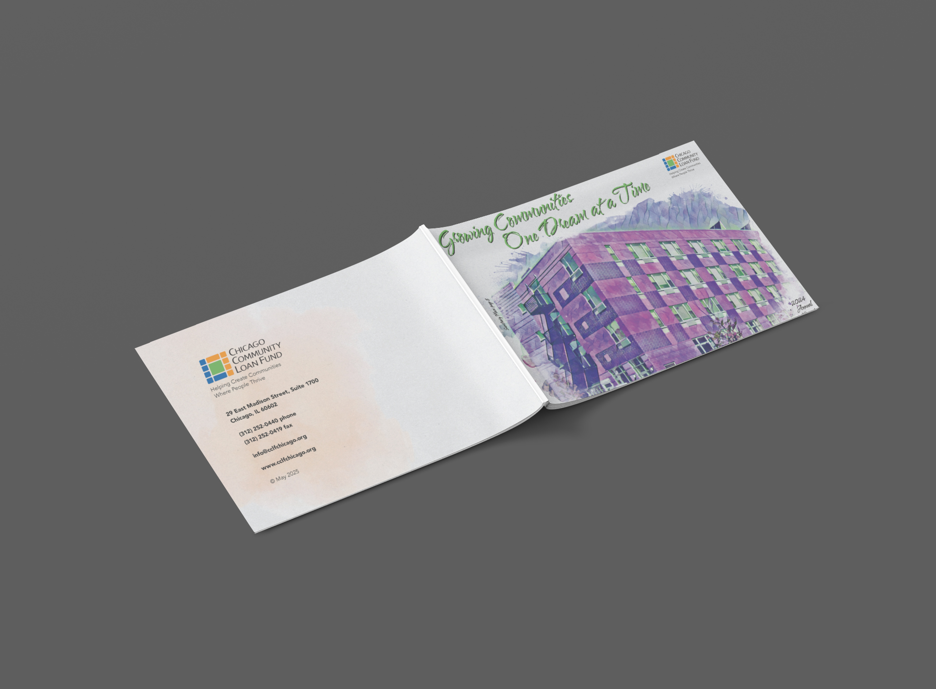
The inspiration for the CCLF Annual Report was rooted in the fluid, transformative nature of community investment—captured through a watercolor visual theme. Watercolor was intentionally chosen as a metaphor for impact: organic, layered, and expansive, much like the ripple effects of funding and partnership within communities. The soft gradients and expressive brush textures reflected growth, movement, and possibility, while still allowing space for structure and clarity within the report’s data and storytelling. The blending of colors symbolized collaboration—organizations, donors, and communities working together to create meaningful change. This artistic approach brought warmth and humanity to the annual report, transforming it from a traditional financial document into a visually engaging narrative that celebrated progress, partnership, and the power of collective investment.
The design elements centered around a refined pastel color palette that brought softness, warmth, and approachability to the annual report. Muted washes of blush, sage, sky blue, and lavender echoed the watercolor theme while providing visual contrast for charts, pull quotes, and section dividers. Pastels were used strategically to create calm visual rhythm across spreads, allowing bold typography and key statistics to stand out without overwhelming the reader. Transparent layering effects and subtle gradients added depth, reinforcing the organic feel of watercolor while maintaining a structured grid system for clarity. The result was a harmonious balance between artistic expression and professional polish—elevating financial data and impact stories through thoughtful, cohesive visual design.
The watercolor-driven design elevated the CCLF Annual Report into an emotionally resonant storytelling piece rather than a purely financial document. The soft pastel palette and fluid visual transitions created an inviting reading experience that encouraged deeper exploration of the content. By pairing expressive design with clearly structured data visualizations, the report made complex funding outcomes accessible and engaging for diverse stakeholders—from donors and partners to community leaders. The warmth of the aesthetic reinforced CCLF’s mission-driven values, while the clear hierarchy ensured key metrics and impact stories were easily understood. The result was a report that strengthened brand perception, increased stakeholder connection, and amplified the visible power of community investment.