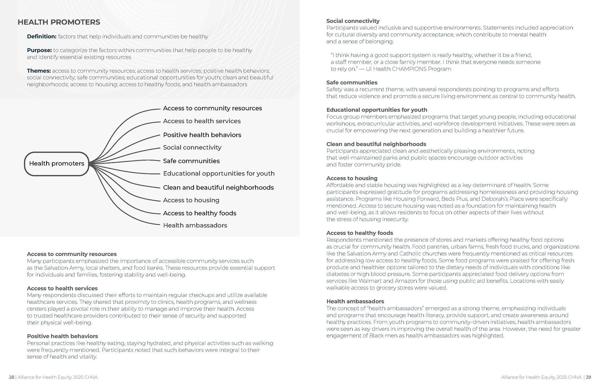
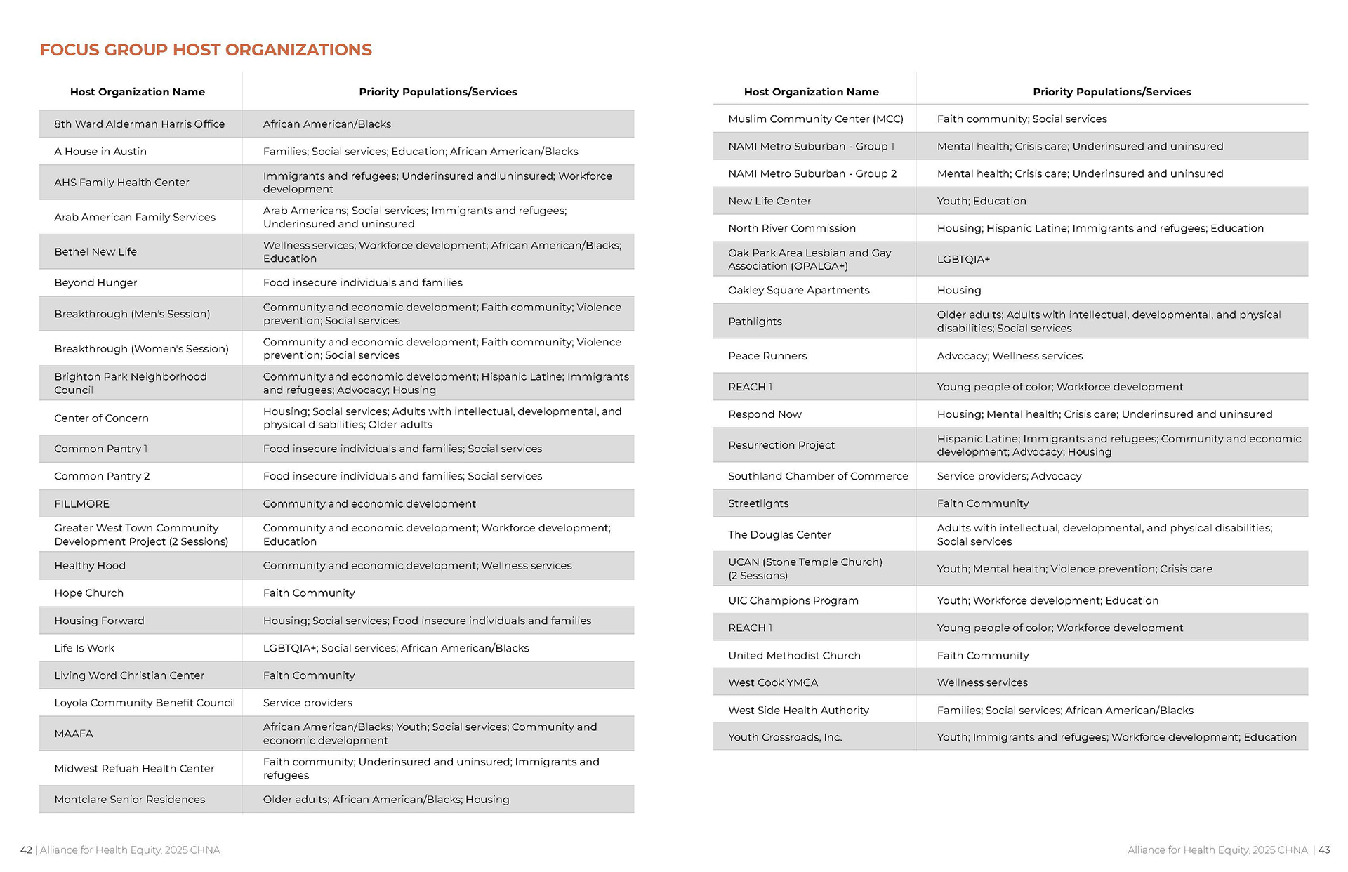
01 —
Deliverables
- DIGITAL DESIGN OF 192 PAGE COMMUNITY HEALTH NEEDS ASSESSMENTS (CHNA) REPORT & 44 PAGE FOCUS GROUP REPORT
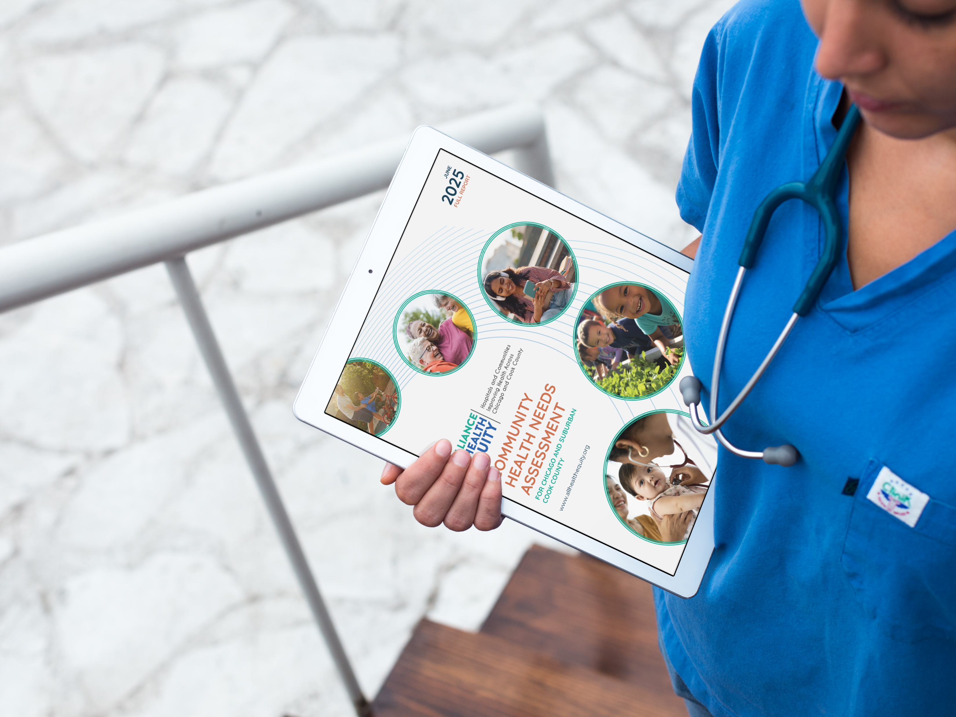
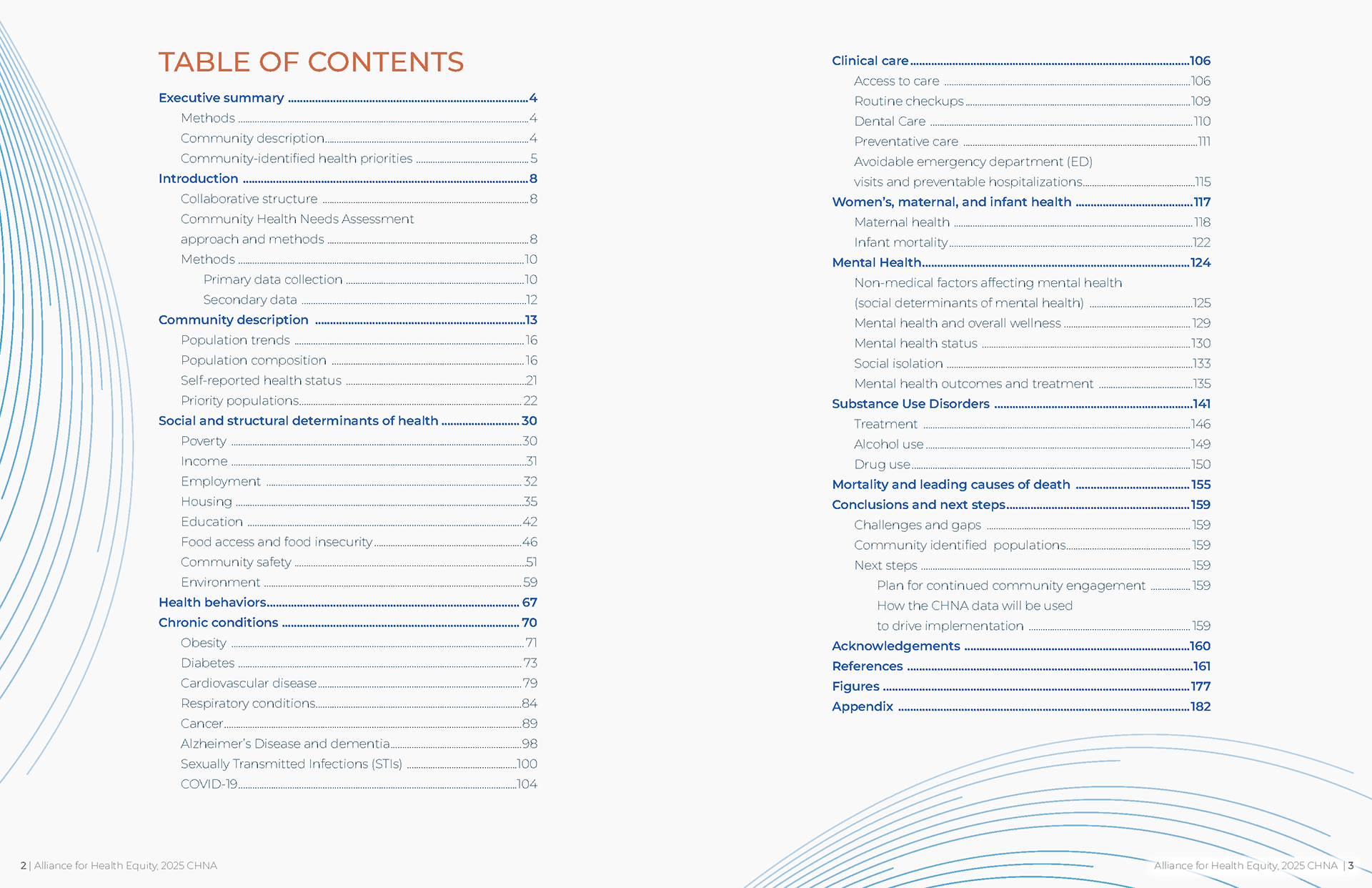
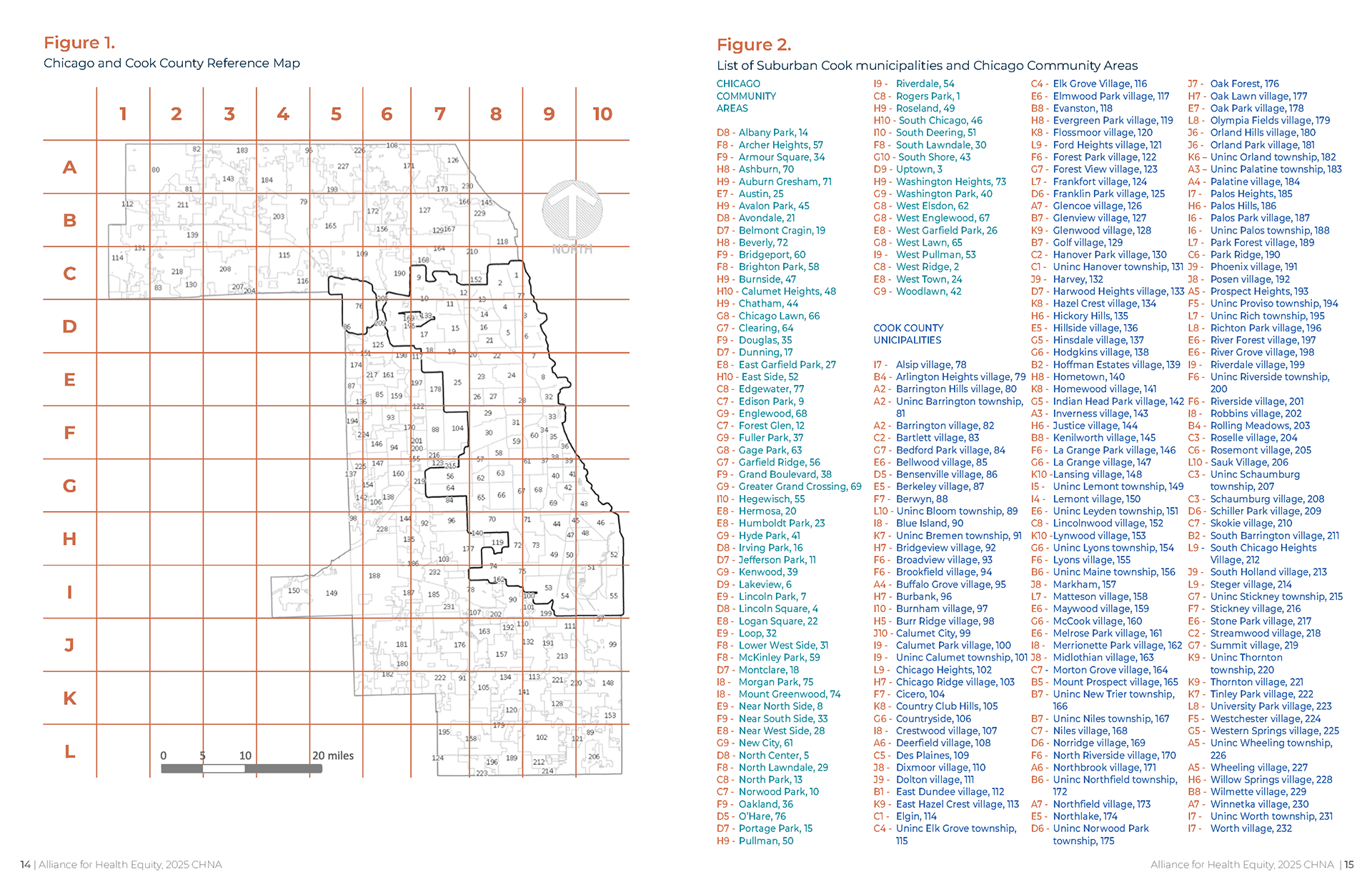
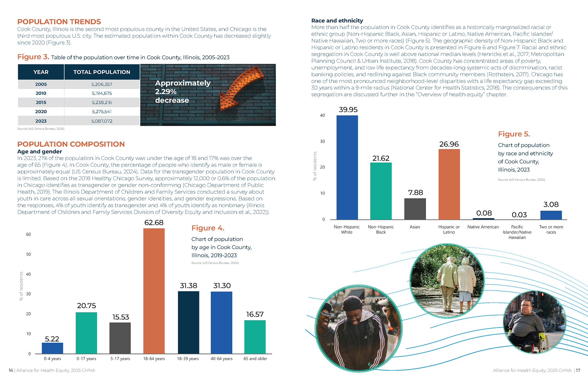
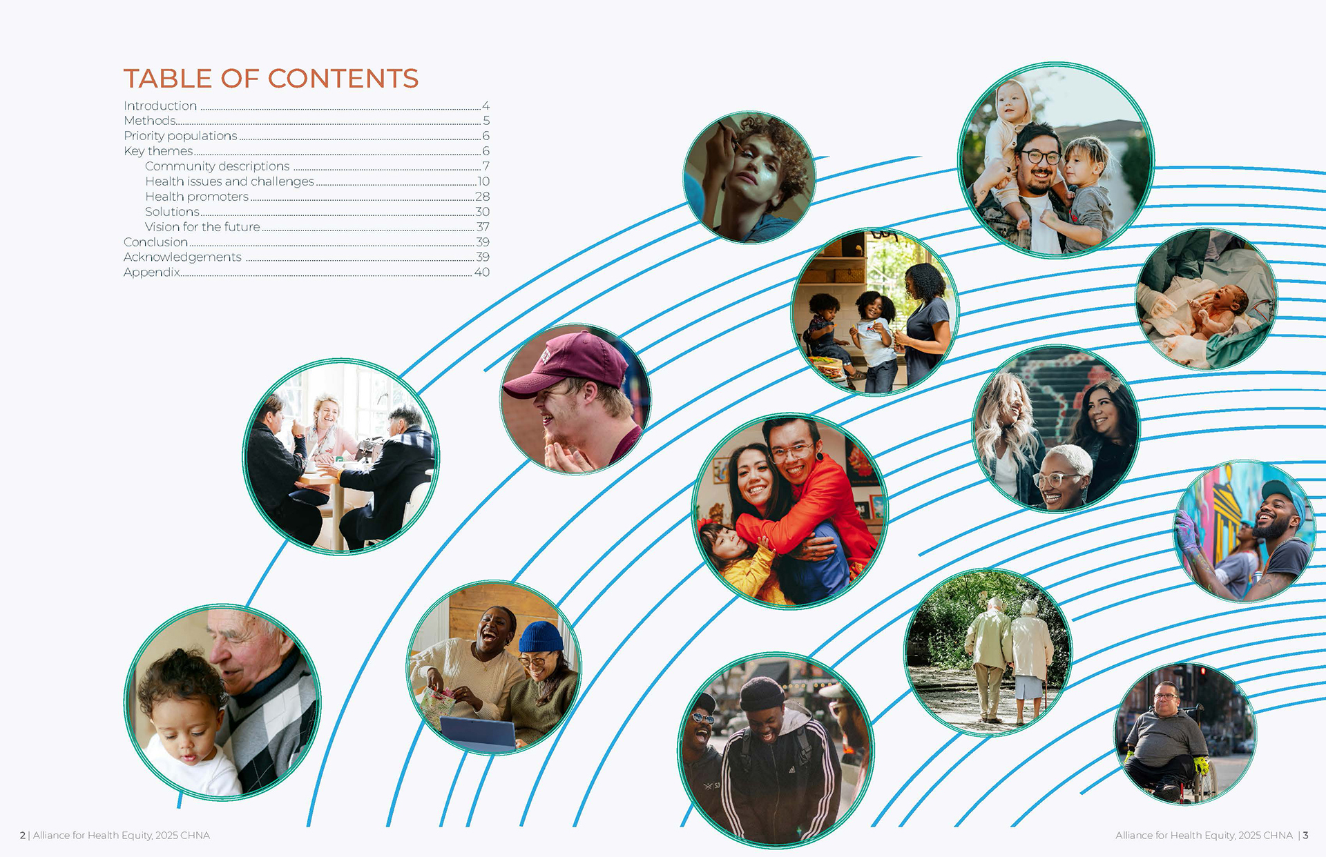
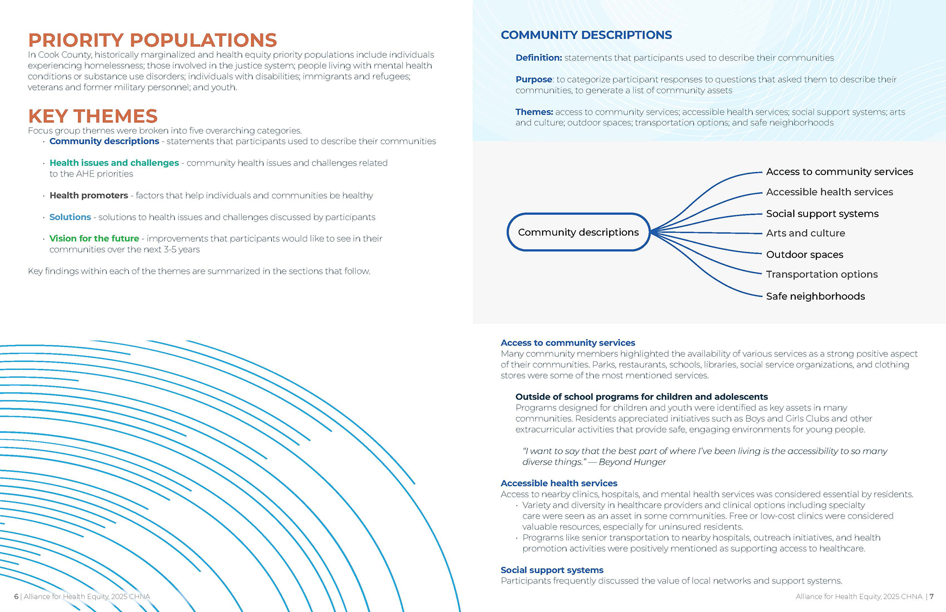
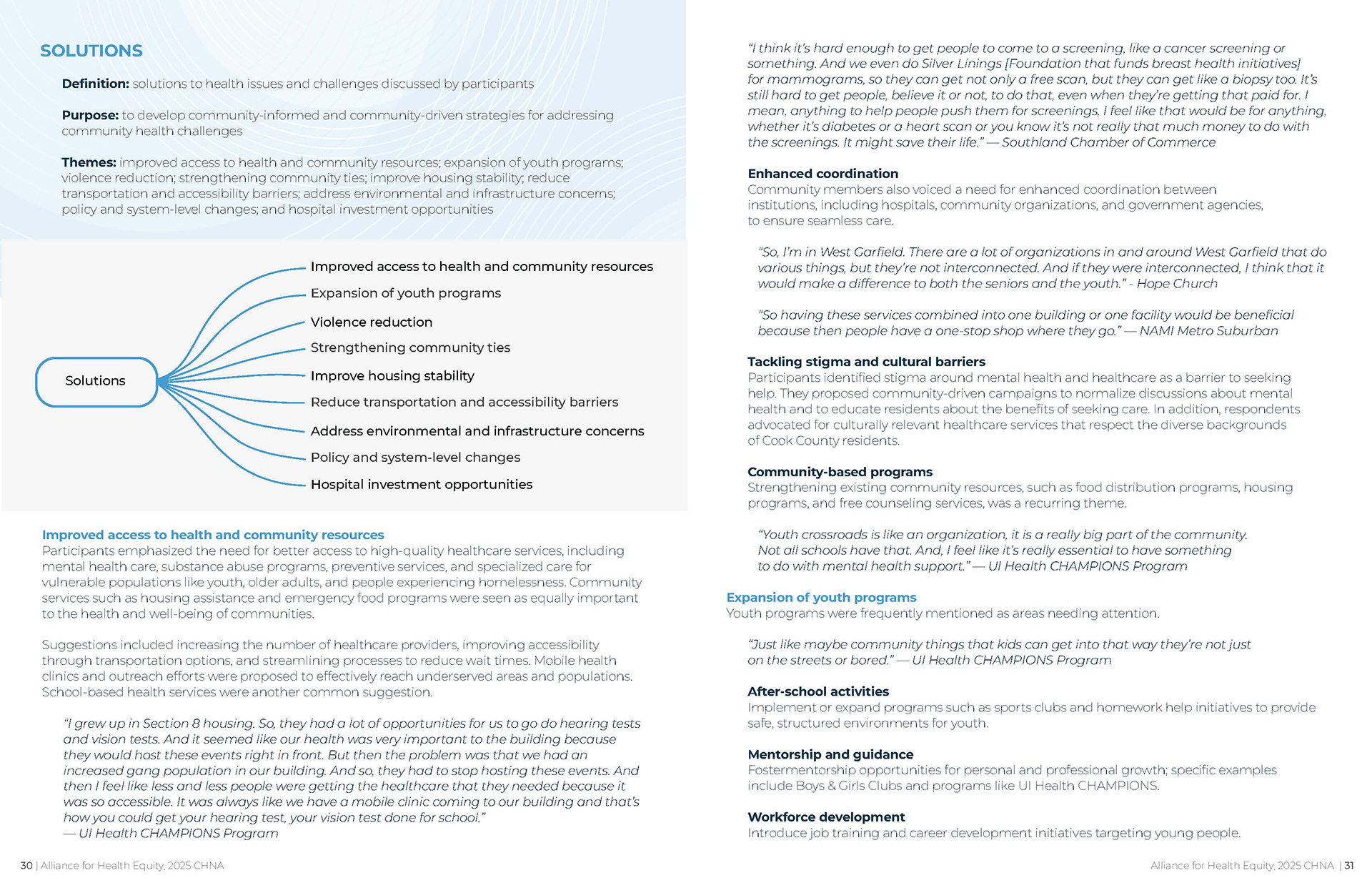
The visual design for the 192-page Community Health Needs Assessment (CHNA) Report and 44-page Focus Group Report was inspired by the responsibility of transforming complex health data into clear, human-centered storytelling. The goal was to bridge statistics and lived experience—allowing charts, graphs, photography, and narrative to work together as a cohesive visual language. Rather than presenting data as dense or overwhelming, the design focused on clarity, accessibility, and visual hierarchy to guide readers through key insights with intention and care. Photography grounded the research in real communities, while thoughtfully structured infographics translated quantitative findings into digestible, impactful visuals. The inspiration was rooted in equity and transparency—ensuring the report not only informed stakeholders but empowered them to understand, engage, and take action based on the findings.
Bold typography was used strategically to establish strong visual hierarchy, highlight key statistics, and guide readers through complex health data with clarity and confidence. A purposeful color palette was developed to balance professionalism with approachability—using vibrant yet structured color blocks to differentiate sections, emphasize data points, and create visual consistency across the 192-page CHNA and 44-page Focus Group Report. Photography was carefully integrated to humanize the data, connecting charts and graphs to real community experiences and reinforcing the report’s equity-centered mission. Clean grid systems, ample white space, and thoughtfully designed charts and infographics ensured readability while maintaining visual impact, transforming dense research into an engaging, accessible visual narrative.
The visual design of the CHNA and Focus Group reports elevated the research from a traditional document into a strategic communication tool. By transforming dense data into clear charts, compelling infographics, and visually structured narratives, the reports increased readability and encouraged deeper stakeholder engagement. Community photography and highlighted key findings created emotional connection alongside analytical insight, allowing readers to see both the numbers and the people behind them. The accessible layout and strong visual hierarchy supported decision-makers, healthcare leaders, and community partners in quickly identifying priorities and opportunities for action. The result was a report that not only informed—but mobilized conversation, collaboration, and forward-focused community impact.